Web Design and Publishing: Session four
CSS page layout
Let's look in detail at how we can set up the layout of our page using CSS.
The simplest layout to start off with is a header (often called a banner) section which spans the width of the page, with a left sidebar and main content area beneath the header. A wrapper div encloses all the other divs. It's a good idea to sketch out your layout on paper before you start. Here's a diagrammatic example:
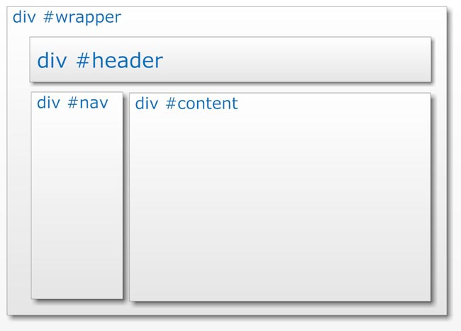
The wrapper enables us to apply a width to the overall design, and to centre it in the browser window, however wide the user's browser might be.
To create this layout, first set up the styles in the stylesheet (this is the example as shown in Session three, CSS selectors).
Note that each id name is preceded by a # sign.
| body { | text-align: center; |
| } | |
| #wrapper { | width: 960px; |
| margin: 0 auto; | |
| text-align: left; | |
| } | |
| #header { | color: #FFF; |
| background-color:#2D73B9; | |
| } | |
| #nav { | color: #FFF; |
| background-color:#00A54E; | |
| width: 300px; | |
| float:left; | |
| } | |
| #content { | color: #FFF; |
| background-color:#E3372E; | |
| margin-left:320px; | |
| } |
We haven't seen some of these style properties before, so I'll describe their purposes:
body {text-align: center; } : this style declaration centres elements contained within the body tag
#wrapper styles:
width:960px; : this sets the width of the page's contents to 960 pixels, and average width for a web page
margin: 0 auto; : sets the top and bottom margin of the wrapper div to zero, and the right and left margins to auto (i.e. the browser will make right and left margins equal, which has the effect of centring the page, when used in combination with the text-align: center property added to the body selector)
text-align: left; : this sets the text-alignment to left, overriding the text-align: center applied to the body selector which we used to centre the #wrapper
#header has only color and background-color style properties added.
#nav, as well as color and background-color, has the following styles applied:
width: 300px; : sets a width for the #nav div; we must give an element a width before we add the float property to it
float: left; : floats the selected element to the left of elements following it on the page (i.e. the #content div) within the containing element (i.e. the #wrapper)
#content, as well as color and background-color, has the following style applied:
margin-left: 320px; : gives the #content div a left-hand margin so that, rather than moving up behind the floated #nav div, its background and text content are positioned to the right of the left-floated div. (See how this works in the screenshots below.)
You have seen the HTML code for this page before, but here it is again, as a reminder of how the id selectors are applied using <div> tags:
<!DOCTYPE HTML public "-//W3C//DTD HTML 4.01 Transitional//EN"
"http://www.w3.org/TR/HTML4/loose.dtd">
<html>
<head>
<title>id selectors </title>
<meta http-equiv="content-type" content="text/HTML; charset=UTF-8">
<link href="css/styles.css" rel="stylesheet" type="text/css">
</head>
<body>
<div id="wrapper">
<div id="header">
<h1>Using id selectors to create a CSS page layout </h1>
</div><!--closes header div-->
<div id="nav">This is the div #nav</div><!--closes nav div-->
<div id="content">
<p>This is the div #content</p>
<p>We have now done most of the work we need to create a CSS page layout!</p>
</div><!--closes content div-->
<hr class="green">
Back to <a href="../selectors.html#back2">coursenotes</a>
</div><!--closes wrapper div-->
</body>
</html>
View the page which has these styles applied.
Screenshots
The following screenshots show how the styles are applied. View the screenshots and read the explanatory text, then have a go at creating your own version.
Screenshot one, below, shows the four divs created, but with no width, float or margin styles added. Notice that the divs are displayed in the order in which they are written in the HTML code.
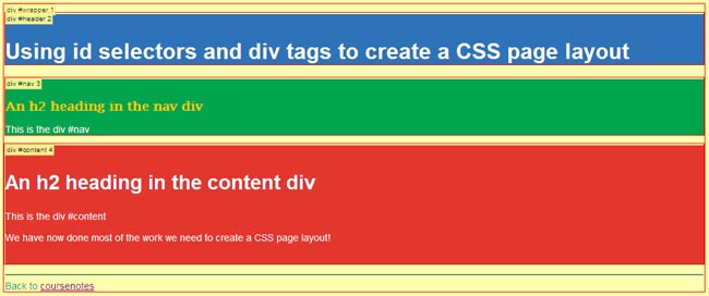
Note: To see div names, and their HTML order number, select Information > Display Div Order in the Firefox web developer toolbar.
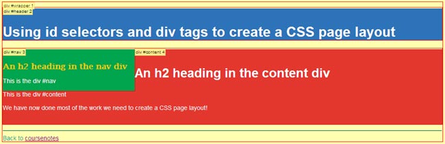
In screenshot two, below, width and float properties have been added to the #nav div. Notice how the the #content div moves up into the space left vacant. The background of the #content div slides underneath the #nav div, but its text content does not.
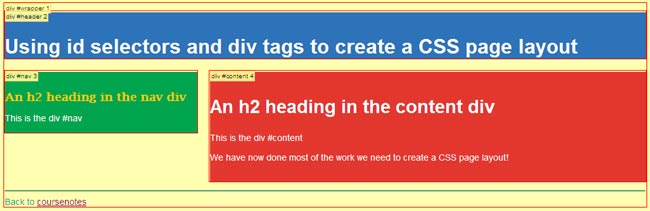
In screenshot three, below, we see the completed page layout. Adding the margin-left property to the #content has moved its background to the right of the #nav div, creating a neat space between the two page elements.
Create your own CSS page layout
To make your own page with CSS layout:
- create a new HTML document
- add content to identify the following page sections, and in the following order:
- header or banner section (for the website name and, later, logo)
- sidebar which will contain site-wide navigation links
- main content section
- surround each section of content with <div> </div> tags
- assign an id attribute and value to each section's <div> tag, for example
<div id="header"> - ensure you have added the <link> tag to the head section of your HTML document to link it to your stylesheet
- save the HTML file as layout.html
- in the stylesheet you have already made, add the styles as shown above (but with more pleasing colour choices!) and save the file
- view your layout.html file in the browser
This simple page layout is reasonably easy to create, and is accessible to all users (unlike older-style table layouts). We can add additional styling to make the page look more pleasing (which we'll come to later on in the course), but the basic CSS layout is complete.
As you progress, you will come across highly sophisticated CSS page layouts which are complex to construct. The basic principles we have covered in this session lay the foundation for your understanding of such uses of CSS, and for your own further self-study in this exciting and creative area of web design.
For the purposes of this course, creating pages with a page layout similar to the one demonstrated here is perfectly adequate.